http://cs5tutorial.net/creating-a-typographic-wallpaper/
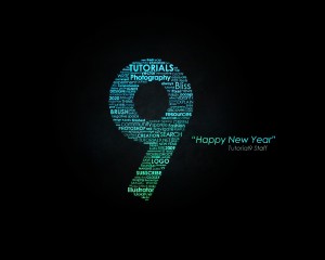
After writing my previous tutorial here about Creating a Zune in Photoshop, several viewers asked if I’d share how I created the wallpaper graphic. In this tutorial, you’ll learn how to make something similar, and it’s quite easy!
This is by no means an in depth look at typography. Typography is a subject folks have written many, many books on, and there is a lot to be learned about it. I’d definitely suggest picking up a book like “Thinking With Type” if it’s something you find interest in.
Create a new document with the dimensions you desire. My desktop is 1280x1024px, so that will be my document size. Set your foreground color to a dark gray (#111111) and your background color to black (#000000). Then grab the Radial Gradient Tool and create a light to dark gradient near the center of your document.


We also need to think of how different we want the type to appear. Do we limit ourselves to one font? I’m going to only use the font Century Gothic, because it has a strong yet clean look, and will allow me to easily fit the font into the 9. Feel free to use multiple fonts in your own work. Since I’m only using one font, I’m limited to ways I can make each phrase stand out. For this, I can use different font sizes and styles. I can increase the size of a font and make it bold so that it stands out, or I can make it smaller and use a crisp or smooth style to make it more subtle.
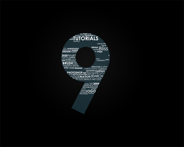
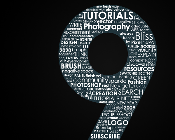
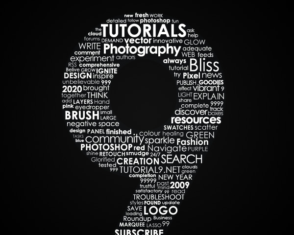 Then place all of your text layers (except the 9) into a Group (Layer > New > Group). Duplicate the group by right clicking it and selecting Duplicate Group. Click OK when the dialog box appears. The reason we duplicated the group is so that we can merge all of our text layers into one. With the new group selected, right click it and select Merge Group. This will take all of the layers in our group and place them onto a single layer. Now you can hide the group that still has all of the text layers in it since we have this single layer with all of our text.
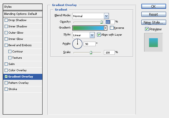
Select your merged layer in your layers palette and add a Gradient Overlay (Layer > Layer Style > Gradient Overlay). I used a nice green (#48a248) for the bottom and a blue (#3bb2f7) for the top.
Create a new layer and set your foreground to #6dcff6 and background to #000000. Then go to Filter > Render > Clouds. After your layer is filled with a mixture of blue and black “clouds”, set the layer to Overlay and lower the Opacity to 25%.
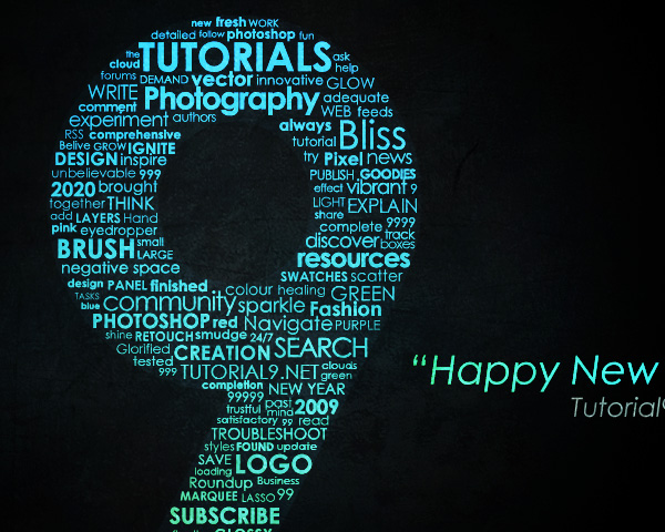
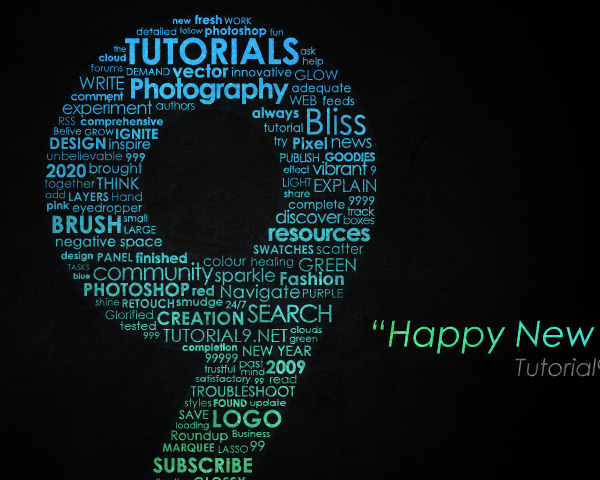 Create another new layer and change your background color to white. Once again go to Filter > Render > Clouds to fill your layer with blue and white “clouds”. Then set your layer to Overlay and lower the Opacity to around 70%.

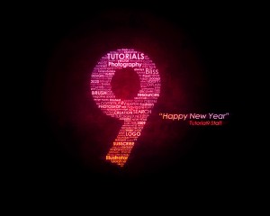
To get the effect above, I created a new layer and went to Image > Apply Image. Then I used a Filter > Blur > Motion Blur and set the layer to Lighten with 35% Opacity. After that, I created a Gradient Map (Layer > New Adjust Layer > Gradient Map) that went from #ec008c to #e77418. Finally, I set the gradient map layer to Vivid Light
After writing my previous tutorial here about Creating a Zune in Photoshop, several viewers asked if I’d share how I created the wallpaper graphic. In this tutorial, you’ll learn how to make something similar, and it’s quite easy!

What is Typography?
In order to create a typographic wallpaper, it would make sense to know a bit about Typography in the first place. Typography is the art and technique of arranging movable type. What does this mean? It means that text itself portrays a message all of its own. Its location, font-family, font-style, color and size all determine the message it portrays. Using a really blocky font for a wedding image wouldn’t make sense, because blocky text isn’t elegant or extravagant, like cursive and curly fonts can be. While this tutorial won’t focus on the essence of typography, understanding what makes type look good will help to create a great design.This is by no means an in depth look at typography. Typography is a subject folks have written many, many books on, and there is a lot to be learned about it. I’d definitely suggest picking up a book like “Thinking With Type” if it’s something you find interest in.
Step 1 – Creating the Background
The background of our wallpaper is going to help set the mood. Using a dark background will allow us to make the typography we use later really stand out of our image.Create a new document with the dimensions you desire. My desktop is 1280x1024px, so that will be my document size. Set your foreground color to a dark gray (#111111) and your background color to black (#000000). Then grab the Radial Gradient Tool and create a light to dark gradient near the center of your document.

Step 2 – Setting Our Text Boundary
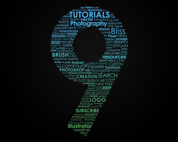
Since I want my text to be in the shape of a 9 (in relation to 2009 and Tutorial9), the easiest way to achieve the shape is going to be to create a large 9 and then use it to place our other text. To accomplish this, grab your Type Tool. Then place a 750px 9 using the font Century Gothic set to bold so that it is located in front of the center of your gradient. I also set my to the color #6dcff6 since my font will look blue later. Then lower the opacity of the layer to around 20%, since it is only being used as a guide.
Step 3 – Placing the Type
Now that we have our boundary area, we are ready to start adding our type. Before jumping into the vast pool of words to fill the 9, think about what you want ahead of time. Since my wallpaper is related to Tutorial9, I will fill mine with words that define the site, such as Photoshop, Design, and Tutorials.We also need to think of how different we want the type to appear. Do we limit ourselves to one font? I’m going to only use the font Century Gothic, because it has a strong yet clean look, and will allow me to easily fit the font into the 9. Feel free to use multiple fonts in your own work. Since I’m only using one font, I’m limited to ways I can make each phrase stand out. For this, I can use different font sizes and styles. I can increase the size of a font and make it bold so that it stands out, or I can make it smaller and use a crisp or smooth style to make it more subtle.


Step 4 – Coloring the Text
Now that we have a vast stream of words filling our 9, we need to make this image look amazing! Lets start by lowering the opacity of our 9 to around 2%. This way it will help give some border around our text, but not too noticeable.
Select your merged layer in your layers palette and add a Gradient Overlay (Layer > Layer Style > Gradient Overlay). I used a nice green (#48a248) for the bottom and a blue (#3bb2f7) for the top.


Step 5 – Adding a Title
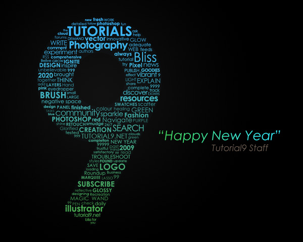
Let’s add a nice title to our wallpaper. I’m going to add the text Happy New Year (Centruy Gothic / 36px / Italic) and use the same gradient overlay as before, except from left to right instead. Then I’m going to add the text Tutorial9 Staff (Century Gothic / 24px / Italic) with the color #736357.
Step 6 – Adding Texture
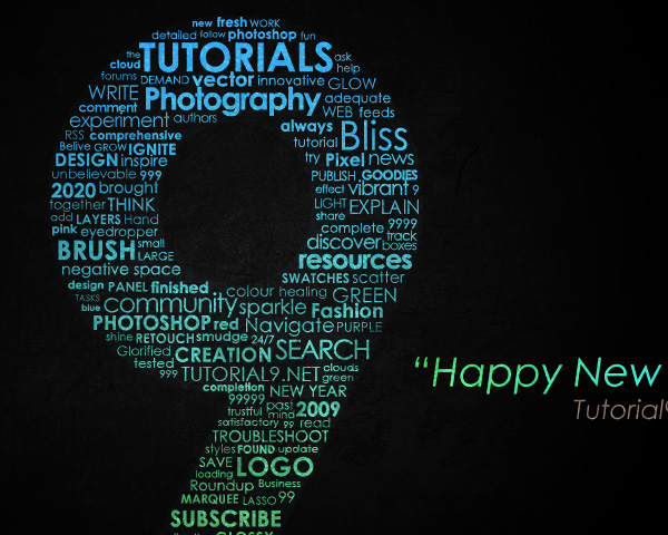
Now let’s add a texture over our image. I grabbed an image off of sxc.hu. Place the texture on a new layer on top of your document. De-saturate the image (Ctrl+Shift+U) and set the layer to Overlay.
Step 7 – Re-Colorization
In the next steps, we are going to add some more random and vibrant color to our image.Create a new layer and set your foreground to #6dcff6 and background to #000000. Then go to Filter > Render > Clouds. After your layer is filled with a mixture of blue and black “clouds”, set the layer to Overlay and lower the Opacity to 25%.


Simple enough?
As you can see, the hardest part of this tutorial was filling the document was text. Adding effects was actually quite simple. After learning all of the tools in Photoshop you will find yourself creating complex works with minimal effort! Feel free to experiment and create your own unique works.

To get the effect above, I created a new layer and went to Image > Apply Image. Then I used a Filter > Blur > Motion Blur and set the layer to Lighten with 35% Opacity. After that, I created a Gradient Map (Layer > New Adjust Layer > Gradient Map) that went from #ec008c to #e77418. Finally, I set the gradient map layer to Vivid Light
No comments:
Post a Comment