One of the most fundamental issues of photography and painting is color and color combinations. The difference is that, while the artist is free to create your own color, the photographer can only choose the colors available for inclusion in the image.
artists can master colors by mixing colors, he has a certain taste in color and the number of tones is not limited. As in photography, the colors have existed before we start shooting. What we can capture on film / sensor is separated from the debris of the color harmony of nature. The number of colors is infinite in nature photography, but they can not mix colors and create new paintings are. The colors the basic concept of the basic colors (primary colors to create other colors) from a long and often start from the pure colors found in nature. To date we agreed to two different systems, the direct light is three primary colors: Red-Blue-green and light reflective system has three different basic colors: Red-Yellow-Blue .
Three primary colors of light directly (Red-Blue-Green) was created by the illumination directly (on the sensor, the screen), the results will be mixed with each other for the white
three primary colors of the reflection of light (Red-Yellow-Blue) generated by the pigment in or on paper, when mixed together will be black, this is the third primary color in painting
in painting, almost all colors are generated by a mixture of the following six colors: three primary colors (Red-Yellow-Blue) and three secondary color grade 2 (Orange-Green-Violet) plus White, black or gray. Because photography inherited the knowledge from the painting so we will turn the color of this research. In the world around us most of the color is the result of reflected light, except for the direct luminous objects like the sun, lamps ... saturation (saturation): The colors of "pure" completely saturated, then its intensity (color) max. In fact in the life of color rarely fully saturated, they are "dirty" than dull, even saturation = 0 (white, gray or black), so the color "purity" has always been used as the focus of a picture if we find them in nature. In fact, you can reduce the saturation of a color by adding white, black, gray or a complementary color. In fact, rarely get fully saturated colors in nature, in addition to the flowers pigments and some animals, even the blue sky is not saturated as we feel
Brightness (luminate)
maximum intensity of light depends on the colors, yellow is the brightest color, the darkest purple, bright colors make up light or dark, the white and black are two extremes. Remember that a light intensity corresponding to one color, gold color exists only in "tone" light, red or pink and the loss of its properties if they are too bright, blue hand, most of the brightness (from dark to light I still feel it is blue), orange with characteristics similar to the yellow and green-like blue, and purple is the most irritating If it lights up a little into color "lavender" closer than it was dark dark blue. The intensity of light in photography depends on the metering (exposure), by changing it will draw the different effects of color.
Light intensity varies according to color, always bright yellow, when it became dark yellow ground, while always dark purple, light up if it becomes colored pale, we also see that the yellow storm Air brighter more saturated violet
The decrease in brightness a little boost of color, if we reduce more light will cause them to become dark and black, brightening the opposite if the momentum will lack the characteristic color, they become "re- " Color Temperature Color Temperature is also a certain influence to change the color.
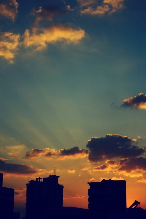
Figure 1: The orange color of the incandescent lamp in the theater as opposed to a very high color temperature (bluish) light of sunset in a park in Tokyo. Figure 2 early morning shooting in New York, the color of sunlight and heat as opposed to cold in the shade blue reflects the sky blue color of the objects themselves are objects around us is not color, when the song light on an object depending on the nature of the material that has different effects. The light waves can be objects (depending on structure) absorbed or reflected back.
If the material absorbs all light waves will see the black, reflecting the end will produce white, also reflects a character, then we will see the color of that wavelength. For example in the picture below, we will see a red orange material because it reflects most of the red and yellow waves.
Red
on red, the sight is one of the most popular color, capable of engaging the viewer immediately. If placed next to the cooler colors (green, blue), then drag the red will look strange, effectively creating "space" in the picture. It is also the color contains the most energy and creates a "vibration" is very strong when placed close to other colors. While the bright yellow "transparent", red is relatively "dense". Yellow emit red light was radiating energy. Emotional, red for feelings alive, strong, hot, passionate. It also symbolizes power, ferocious, dangerous, forbidden. Red is used in many Asian cultures, including Vietnam.
 Yellow
Yellow is the brightest color in the color and it is also the special nature of it, dark yellow does not exist, when mixed with black and yellow color is not yellow anymore. Yellow only lost white light, so we usually see a yellow background darker. Yellow glow in the photos, which is coordinated by the bright yellow hard with other colors. All colors are changed when the special nature of the yellow side, but particularly "sensitive". The figure below shows the yellow "intense" when placed next to black, but rather bland white standing together.
Blue
color is a quiet, dark and very cold. It is very common in photography and many different disguises. Vision, blue back away and feel more serene red a lot, as dark as possible in three basic colors, the dark again quite strong. I can feel blue when it is fresh and pure.
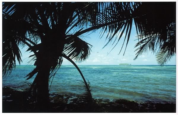
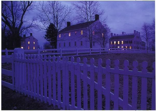
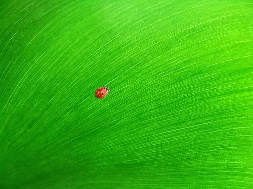
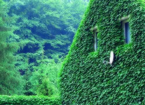
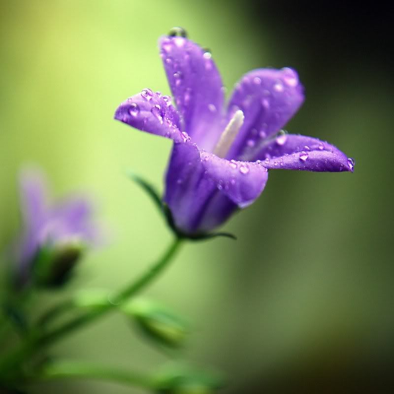
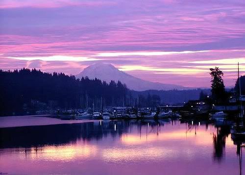
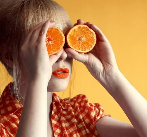
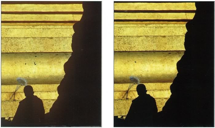
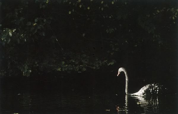
Blue color saturation is most easily found, like the sky without clouds. Water absorption properties with depth, so the water often has green turns blue. A scene of the Caribbean coast, the water reflects the sky so bright and re-horizon than in plots The best moment to find the blue is just after sunset or before sunrise, the light reflected into the sky. Shot mode with "daylight" setting for a cold and gloomy Green: No matter associated with the symbols well, a picture if there is a "concrete" green whole leaves are considered less attractive charismatic, sometimes contact socks decay, mold of a natural color, eye color blue is the most sensitive and can distinguish many different green , depending on the tilt toward the blue or yellow green that these properties are very different. Is the natural color to blue for the associative and symbolic good, fresh, natural ... Purple: The combination of blue and red, very elusive. Not many people distinguish the pure color. Pure Purple is good, if it becomes too bright colors "lavande" darker than the dark blue mistakenly, turn slightly to the red to magenta color, a little less red into blue. So purple interfere in photography and printing. Purple is a symbol of luxury, mystery, immense, prompted by "hunches" and a strange world. So purple is used in many religions. Purple hard to find in nature. Depending on the light that there was a light purple flowers on dark color by a mixture of light and sky. flower shooting out bright purple light on the dark afternoon sky bluish purple Orange: Color a brilliant orange color, it is closely related to light by heating. Is mixed from red and yellow, it also offers a number of second nature that color. Very bright orange when pure, but powerful when it becomes light beige to dark colors to become "Maron." Orange is the color of heat and aridity. Black: Black is no light and tone color photography in black is created by reducing the brightness. Pure black does not contain any details but it is very important for the density and richness of the image. Black needed to create a contrast with other colors. Black is often used as background, physical description lines (backlit) or to point out. Black often pictured to prop up the other colors. Some pictures do not want to be black when the gentle flair for color (such as fog scene). Excess light, low contrast or mistakes in the handling of digital images as "enemies" of black. Black to contact the middle. It is also associated with wealth and elegance. To obtain "the definition" (sihouette), should have a light background while submerged in close-up as in the picture above. Photographs of the black swan depends on the light black and white and gray to create a re-form may obtain. White: In theory, colorless and white tones, but the actual white color is subtle one, it plays an important role in almost all the photos. Even in a completely black object also needs the bright colors and the rough to duojwc format. A white photographs should be the transformation of the light gray color to shape. Very rarely completely neutral white. When shooting a white light to be measured carefully, especially when taken with digital cameras. The white neutral and generally as a symbol for purity, and imagine the distant or even infinity.
artists can master colors by mixing colors, he has a certain taste in color and the number of tones is not limited. As in photography, the colors have existed before we start shooting. What we can capture on film / sensor is separated from the debris of the color harmony of nature. The number of colors is infinite in nature photography, but they can not mix colors and create new paintings are. The colors the basic concept of the basic colors (primary colors to create other colors) from a long and often start from the pure colors found in nature. To date we agreed to two different systems, the direct light is three primary colors: Red-Blue-green and light reflective system has three different basic colors: Red-Yellow-Blue .
Three primary colors of light directly (Red-Blue-Green) was created by the illumination directly (on the sensor, the screen), the results will be mixed with each other for the white
three primary colors of the reflection of light (Red-Yellow-Blue) generated by the pigment in or on paper, when mixed together will be black, this is the third primary color in painting
in painting, almost all colors are generated by a mixture of the following six colors: three primary colors (Red-Yellow-Blue) and three secondary color grade 2 (Orange-Green-Violet) plus White, black or gray. Because photography inherited the knowledge from the painting so we will turn the color of this research. In the world around us most of the color is the result of reflected light, except for the direct luminous objects like the sun, lamps ... saturation (saturation): The colors of "pure" completely saturated, then its intensity (color) max. In fact in the life of color rarely fully saturated, they are "dirty" than dull, even saturation = 0 (white, gray or black), so the color "purity" has always been used as the focus of a picture if we find them in nature. In fact, you can reduce the saturation of a color by adding white, black, gray or a complementary color. In fact, rarely get fully saturated colors in nature, in addition to the flowers pigments and some animals, even the blue sky is not saturated as we feel
Brightness (luminate)
maximum intensity of light depends on the colors, yellow is the brightest color, the darkest purple, bright colors make up light or dark, the white and black are two extremes. Remember that a light intensity corresponding to one color, gold color exists only in "tone" light, red or pink and the loss of its properties if they are too bright, blue hand, most of the brightness (from dark to light I still feel it is blue), orange with characteristics similar to the yellow and green-like blue, and purple is the most irritating If it lights up a little into color "lavender" closer than it was dark dark blue. The intensity of light in photography depends on the metering (exposure), by changing it will draw the different effects of color.
Light intensity varies according to color, always bright yellow, when it became dark yellow ground, while always dark purple, light up if it becomes colored pale, we also see that the yellow storm Air brighter more saturated violet
The decrease in brightness a little boost of color, if we reduce more light will cause them to become dark and black, brightening the opposite if the momentum will lack the characteristic color, they become "re- " Color Temperature Color Temperature is also a certain influence to change the color.
Figure 1: The orange color of the incandescent lamp in the theater as opposed to a very high color temperature (bluish) light of sunset in a park in Tokyo. Figure 2 early morning shooting in New York, the color of sunlight and heat as opposed to cold in the shade blue reflects the sky blue color of the objects themselves are objects around us is not color, when the song light on an object depending on the nature of the material that has different effects. The light waves can be objects (depending on structure) absorbed or reflected back.
If the material absorbs all light waves will see the black, reflecting the end will produce white, also reflects a character, then we will see the color of that wavelength. For example in the picture below, we will see a red orange material because it reflects most of the red and yellow waves.
Red
on red, the sight is one of the most popular color, capable of engaging the viewer immediately. If placed next to the cooler colors (green, blue), then drag the red will look strange, effectively creating "space" in the picture. It is also the color contains the most energy and creates a "vibration" is very strong when placed close to other colors. While the bright yellow "transparent", red is relatively "dense". Yellow emit red light was radiating energy. Emotional, red for feelings alive, strong, hot, passionate. It also symbolizes power, ferocious, dangerous, forbidden. Red is used in many Asian cultures, including Vietnam.
 Yellow
 Yellow is the brightest color in the color and it is also the special nature of it, dark yellow does not exist, when mixed with black and yellow color is not yellow anymore. Yellow only lost white light, so we usually see a yellow background darker. Yellow glow in the photos, which is coordinated by the bright yellow hard with other colors. All colors are changed when the special nature of the yellow side, but particularly "sensitive". The figure below shows the yellow "intense" when placed next to black, but rather bland white standing together.
 | |
| Yellow fairly bland when standing next to a white ... |
color is a quiet, dark and very cold. It is very common in photography and many different disguises. Vision, blue back away and feel more serene red a lot, as dark as possible in three basic colors, the dark again quite strong. I can feel blue when it is fresh and pure.
Blue color saturation is most easily found, like the sky without clouds. Water absorption properties with depth, so the water often has green turns blue. A scene of the Caribbean coast, the water reflects the sky so bright and re-horizon than in plots The best moment to find the blue is just after sunset or before sunrise, the light reflected into the sky. Shot mode with "daylight" setting for a cold and gloomy Green: No matter associated with the symbols well, a picture if there is a "concrete" green whole leaves are considered less attractive charismatic, sometimes contact socks decay, mold of a natural color, eye color blue is the most sensitive and can distinguish many different green , depending on the tilt toward the blue or yellow green that these properties are very different. Is the natural color to blue for the associative and symbolic good, fresh, natural ... Purple: The combination of blue and red, very elusive. Not many people distinguish the pure color. Pure Purple is good, if it becomes too bright colors "lavande" darker than the dark blue mistakenly, turn slightly to the red to magenta color, a little less red into blue. So purple interfere in photography and printing. Purple is a symbol of luxury, mystery, immense, prompted by "hunches" and a strange world. So purple is used in many religions. Purple hard to find in nature. Depending on the light that there was a light purple flowers on dark color by a mixture of light and sky. flower shooting out bright purple light on the dark afternoon sky bluish purple Orange: Color a brilliant orange color, it is closely related to light by heating. Is mixed from red and yellow, it also offers a number of second nature that color. Very bright orange when pure, but powerful when it becomes light beige to dark colors to become "Maron." Orange is the color of heat and aridity. Black: Black is no light and tone color photography in black is created by reducing the brightness. Pure black does not contain any details but it is very important for the density and richness of the image. Black needed to create a contrast with other colors. Black is often used as background, physical description lines (backlit) or to point out. Black often pictured to prop up the other colors. Some pictures do not want to be black when the gentle flair for color (such as fog scene). Excess light, low contrast or mistakes in the handling of digital images as "enemies" of black. Black to contact the middle. It is also associated with wealth and elegance. To obtain "the definition" (sihouette), should have a light background while submerged in close-up as in the picture above. Photographs of the black swan depends on the light black and white and gray to create a re-form may obtain. White: In theory, colorless and white tones, but the actual white color is subtle one, it plays an important role in almost all the photos. Even in a completely black object also needs the bright colors and the rough to duojwc format. A white photographs should be the transformation of the light gray color to shape. Very rarely completely neutral white. When shooting a white light to be measured carefully, especially when taken with digital cameras. The white neutral and generally as a symbol for purity, and imagine the distant or even infinity.


No comments:
Post a Comment